|
|
The "H"
Mar 3, 2011 11:46:44 GMT -5
Post by mttbrilhart on Mar 3, 2011 11:46:44 GMT -5
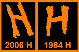
I know Brandon and I had a bit of a conversation about it last October while at the Haunted House, but it's just one of those little things that probably goes unnoticed by most. When the letters were replaced back in 2006, the "H" changed a good bit.
It's just a minor detail, but I thought it could spark some conversation around here.
|
|
|
|
The "H"
Mar 3, 2011 17:20:43 GMT -5
Post by Brandon on Mar 3, 2011 17:20:43 GMT -5
Personally, I hate the new "H". I LOVE the original 1964 "H" just because I think it has so much more character, and it's more symbolic!
|
|
|
|
The "H"
Mar 3, 2011 20:24:46 GMT -5
Post by nickanap on Mar 3, 2011 20:24:46 GMT -5
I like both of them (maybe the old one a little bit more). I don't think the new H takes away from the whole spirit of the attraction.
|
|
|
|
The "H"
Mar 8, 2011 14:55:58 GMT -5
Post by wayne1977 on Mar 8, 2011 14:55:58 GMT -5
I like the original much better, it looks more like an "H". At a quick glance, the new "H" looks a little like an "M". The Maunted Mouse...check out a photo of the facade...maybe it is just me!
|
|
|
|
The "H"
Mar 8, 2011 17:46:37 GMT -5
Post by HHMacabre on Mar 8, 2011 17:46:37 GMT -5
Hmmm... I don't know which I like better!
|
|
|
|
Post by flaggerjohn on Mar 9, 2011 1:55:47 GMT -5
I think they should make it move like the boobs in the torture room.
|
|
|
|
The "H"
Mar 9, 2011 22:38:42 GMT -5
Post by mttbrilhart on Mar 9, 2011 22:38:42 GMT -5
I'm with flaggerjohn, make it move like boobs! This forum is so driven by testosterone it's not even funny!
|
|
|
|
The "H"
Jun 3, 2011 18:22:13 GMT -5
Post by erikals2 on Jun 3, 2011 18:22:13 GMT -5
Seems like an okay idea to me- gyrating letters like the Whacky Shack.
Someone should put the 1964 H back I think - I like it better because it contributes so much more to the original atmosphere of the whole ride.
I have no idea how gyrating letters would work though.
|
|
|
|
The "H"
Jul 24, 2011 11:07:27 GMT -5
Post by gerryu21220 on Jul 24, 2011 11:07:27 GMT -5
They appear to be essentially the same "H" in the example S&FS provided. It's just UPSIDE DOWN in the 2006 example.
|
|
|
|
The "H"
Jul 24, 2011 22:56:45 GMT -5
Post by HHMacabre on Jul 24, 2011 22:56:45 GMT -5
They appear to be essentially the same "H" in the example S&FS provided. It's just UPSIDE DOWN in the 2006 example.  It does look the same, just flipped! It does look the same, just flipped! |
|
|
|
The "H"
Jul 26, 2011 10:08:51 GMT -5
Post by gerryu21220 on Jul 26, 2011 10:08:51 GMT -5
My guess is that they copied it from a photo, but then installed it upside-down without realizing it.
|
|


 It does look the same, just flipped!